Sample pack: Shipnote
Shipnote is a made-up example product, not a customer. On 2026-10-28 we typed its name and the pitch “A changelog and release-notes widget for indie SaaS founders, embeddable in any Next.js app” into the free preview on this site. Everything below is what came back, unedited: the four marks the preview offered, and every file in the paid zip built from the one we picked, in indigo.
What the free preview offered
Four marks, each from a different design approach. Not every one works; you pick the one you want, and the zip contains that exact drawing.
Wordmark
custom Shipnote logotype where the dot of the 'i' becomes a tiny signal flag on a raised mast-like ascender
Monogram
interlocking S and N letterforms where the N's diagonal stroke continues directly into the S's lower curve
Joint concept (picked)
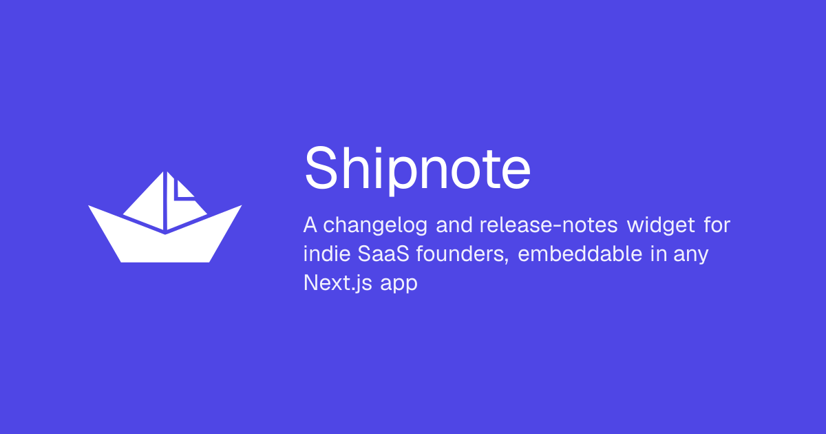
a paper boat (ship) whose triangular sail is folded exactly like a dog-eared note corner
Counterform
two overlapping note cards with their shared overlap carved away to reveal a hull-and-mast silhouette in the void
What the paid zip contains

public/icon-light.svg

public/icon-dark.svg

public/icon-mono.svg
src/app/apple-icon.png
public/apple-icon-dark.png
globals.css.snippet
/* brand: indigo (calm, trusted)
 * Generated by brand-pack. Drop into app/globals.css or merge into your existing :root block.
 * Tokens use light-dark() so the visitor's OS preference drives the theme — no JS toggle needed.
 */
:root {
  color-scheme: light dark;
  --brand: light-dark(#4f46e5, #a5b4fc);
  --bg: light-dark(#ffffff, #0a0a0a);
  --fg: light-dark(#171717, #ededed);
  --muted: light-dark(#6b7280, #9ca3af);
  --border: light-dark(#e5e7eb, #1f2937);
  --accent: light-dark(#4f46e5, #a5b4fc);
  --font-sans:
    system-ui, -apple-system, "Segoe UI", Roboto, sans-serif,
    "Apple Color Emoji", "Segoe UI Emoji";
  --font-mono:
    ui-monospace, SFMono-Regular, Menlo, "Liberation Mono", "Courier New", monospace;
}

body {
  background: var(--bg);
  color: var(--fg);
  font-family: var(--font-sans);
}
README.md
# Shipnote — brand pack

Mark concept: **a paper boat (ship) whose triangular sail is folded exactly like a dog-eared note corner** — Brand color: **indigo** (light #4f46e5, dark #a5b4fc)

## Install (Next.js App Router)

Drop these files into the matching paths in your repo:

```
src/app/icon.svg            → favicon, served on every URL by Next.js
src/app/apple-icon.png      → 180×180 home-screen icon, served by Next.js
public/og.png               → 1200×630 Open Graph image
public/logo.svg             → in-page logo (fill="currentColor", so it takes the text colour)
public/icon-light.svg       → the mark filled with the light-mode brand colour
public/icon-dark.svg        → the mark filled with the dark-mode brand colour
public/icon-mono.svg        → the mark in solid black, for one-colour print
public/apple-icon-dark.png  → the home-screen icon on a dark tile; Next.js does not
                              pick it up by itself, so rename it to
                              src/app/apple-icon.png if you prefer it
globals.css.snippet         → append to your existing app/globals.css
```

Then in your root `layout.tsx`:

```tsx
export const metadata = {
  openGraph: { images: ["/og.png"] },
  twitter: { card: "summary_large_image", images: ["/og.png"] },
};

// theme-color is a meta tag, not CSS, so it needs the hex values themselves.
export const viewport = {
  themeColor: [
    { media: "(prefers-color-scheme: light)", color: "#4f46e5" },
    { media: "(prefers-color-scheme: dark)", color: "#a5b4fc" },
  ],
};
```

## What's in here

- **Single-fill silhouette mark** at `viewBox="0 0 24 24"` — scales from 16×16 favicons to display sizes; recolor with CSS `fill` or `mask`.
- **Light + dark color tokens** declared once with `light-dark()` — the visitor's OS preference picks the theme. Both modes pass WCAG AA contrast against the chosen brand color.
- **System-font UI** — no webfont download, no FOUT.

## License

Files in this pack are yours. Use them however you like — for commercial products, side projects, or open source. No attribution required.